GOTRAVEL • 2022
A smarter way to plan group travel
ROLE Product Designer
SKILLS Product Design, UI Design, User Research
GoTravel is a one-stop-shop travel company looking for a distinct online presence to increase brand visibility and grow their business. By implementing a group trip planning feature, the design addresses one of the most vocal user needs and adds innovative value to the service.
Obs: This project was completed under the EDIT UX/UI Design program. Although not being a shipped product, the research work is truthful and the design based on real insights.
DISCOVERY
Our user research started by framing the design challenge through making questions we needed an answer for:
1. What do users value when planning a trip? And why so?
2. What problems do users most face when planing a trip?
3. How does that change along the process?
4. What are users main concerns when booking flight or accommodation in a post Covid-19 scenario?
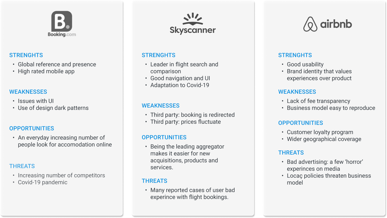
We took a look at the main competitors to underline their strengths and weakness, and to spot unsolved user needs that can be addressed by our own design.
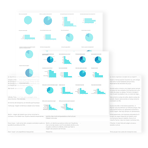
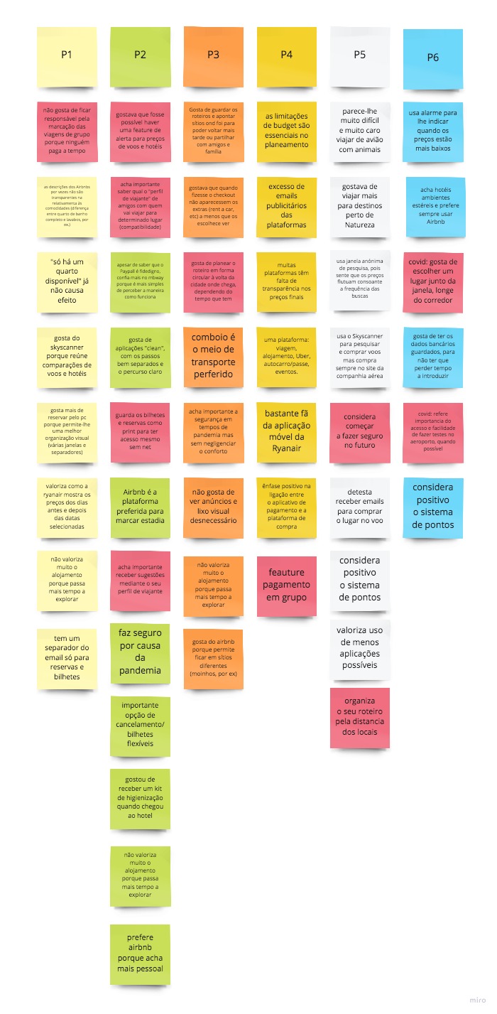
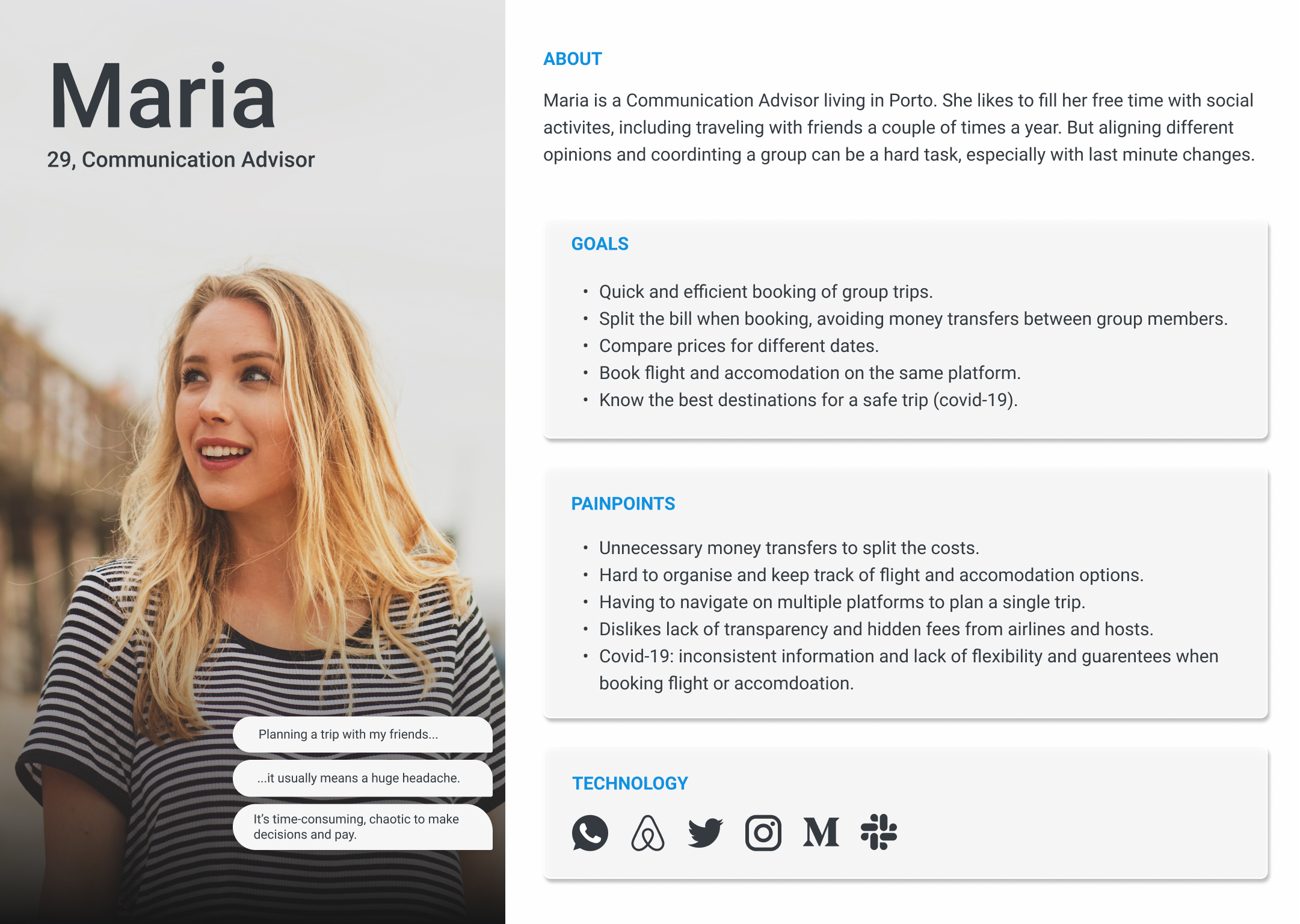
In order to understand real users’ goals and pain points related to travel planning, remote interviews and a online survey were conducted with participants who had at least a few travel experiences and are often responsible for planning their trips
Prominent research insights were withdrawn based on collected data and extensive desk research.
#1 Travelling in group is often a chaotic experience.
The majority of users expresses difficulties when planning a trip with more than two people. From managing communication and keeping track of listed options (destinations, transport, accommodation, routes), to making decisions or even sharing costs.
#2 Users want transparency.
Hidden fees, inflexible conditions or missing information are common concerns among travellers.
#3 Many dislike jumping between platforms.
Juggling between two or more platforms, multiple logins and checkouts to plan one single trip demotivates users and adds complexity to the experience.
#4 Users need guarantees to travel after Covid-19.
Even though we all couldn't wait to explore the world again, most people felt hesitant to travel without the extra flexibility these times demanded.
“[travel planning in group] … it’s difficult to agree on something, to manage communication and to share costs. But it’s so much fun! It’s worth the endless chat.”
“[travel planning in group] … it’s difficult to agree on something, to manage communication and to share the payment. But it’s so much fun! It’s worth the endless chat.”
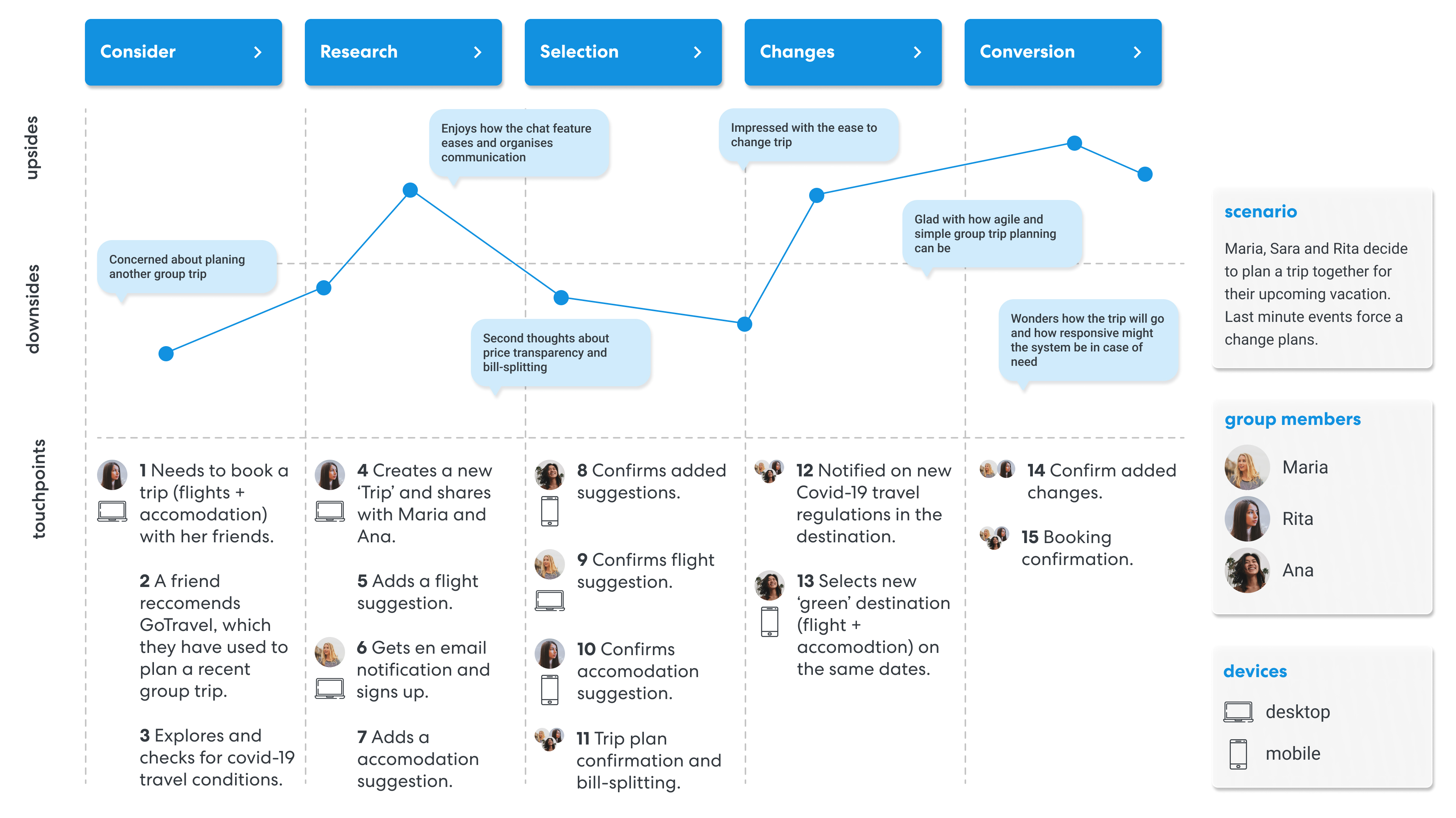
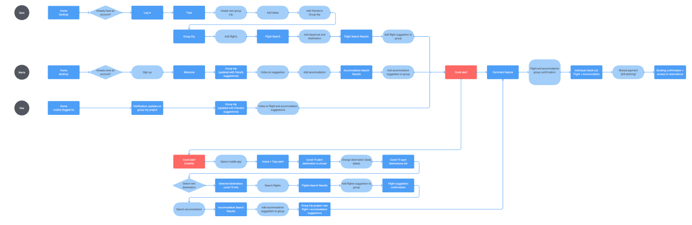
Using the qualitative and quantitative data from user research, we gathered respondents profiles and defined a representative user persona. With their main goals and pain points in mind, a few user flows and a main user journey were created to map the desired user experience.
IDEATION
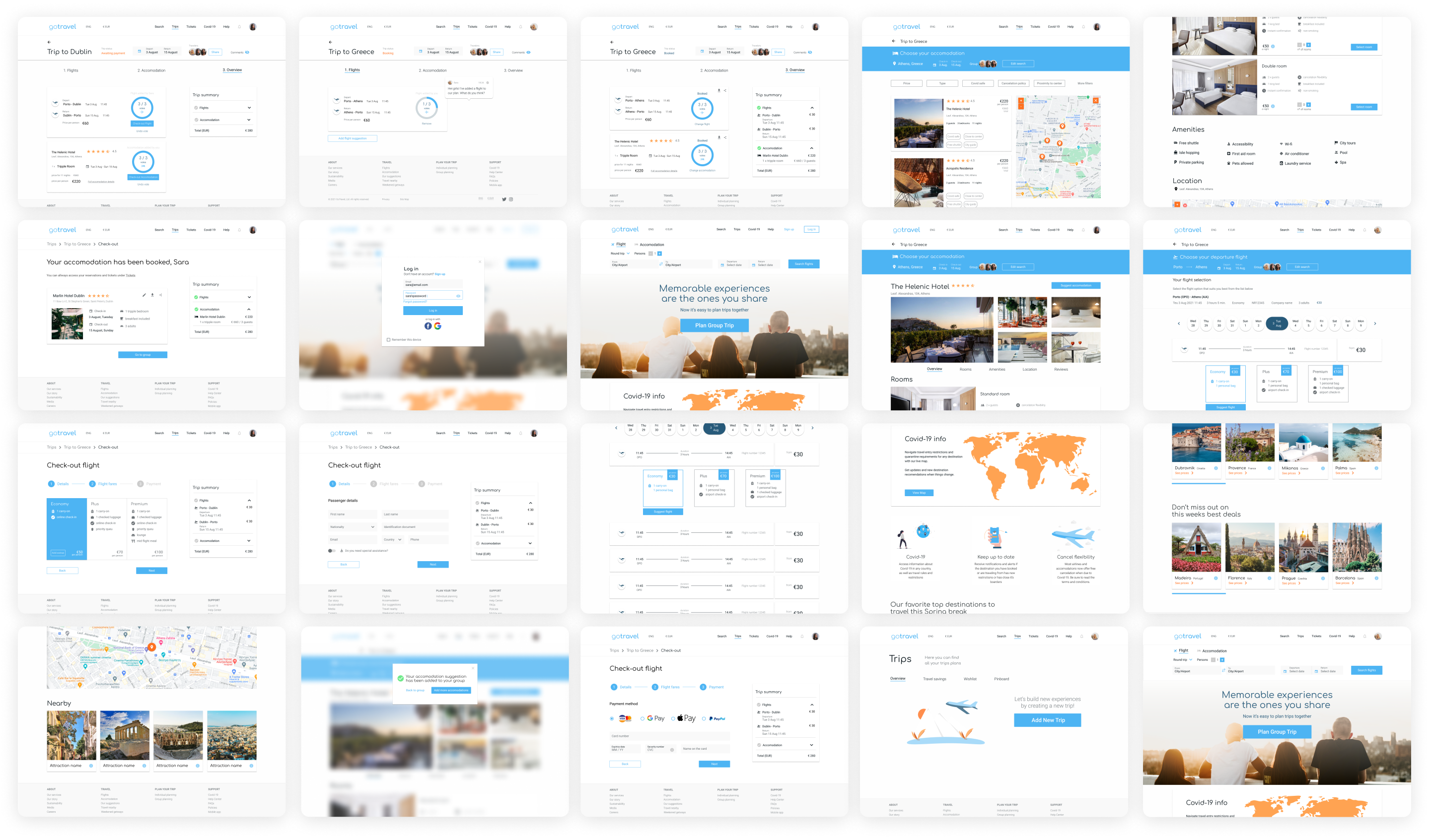
For tangible impact on users’ experience, we developed a simple but yet powerful platform to support basic bookings and the complexity of co-planning a trip in group. Therefore, the interface was designed to accommodate both design patterns and some innovative features. The goal was to reduce the complexity of travel planning in a group.
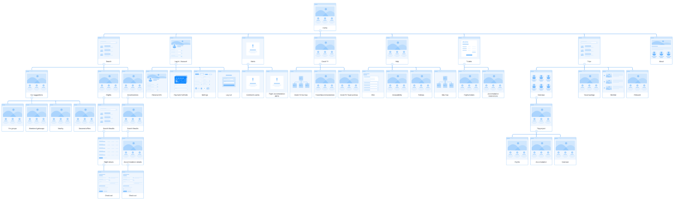
Further on, the interface and information hierarchy were defined at a basic level with sketches, a sitemap and low fidelity wireframes.
TESTING
Before stepping into the visual design, we conducted a round of moderated user testing to assess the design’s usability, most vocal issues and overall user satisfaction. A functional low-fidelity prototype of both desktop and mobile interfaces were created using Figma. Test insights and user feedback lead to the improvement of features associated with tasks where error incidence was higher. This step allowed us to proceed with more confidence in delivering a user-centred service.
Usability evaluation tasks
- Booking accommodation
- Booking one trip in group (flight + accommodation)
- Check Covid-19 regulations in the destination country
Task success rate: 86%
Task error-free rate: 74%
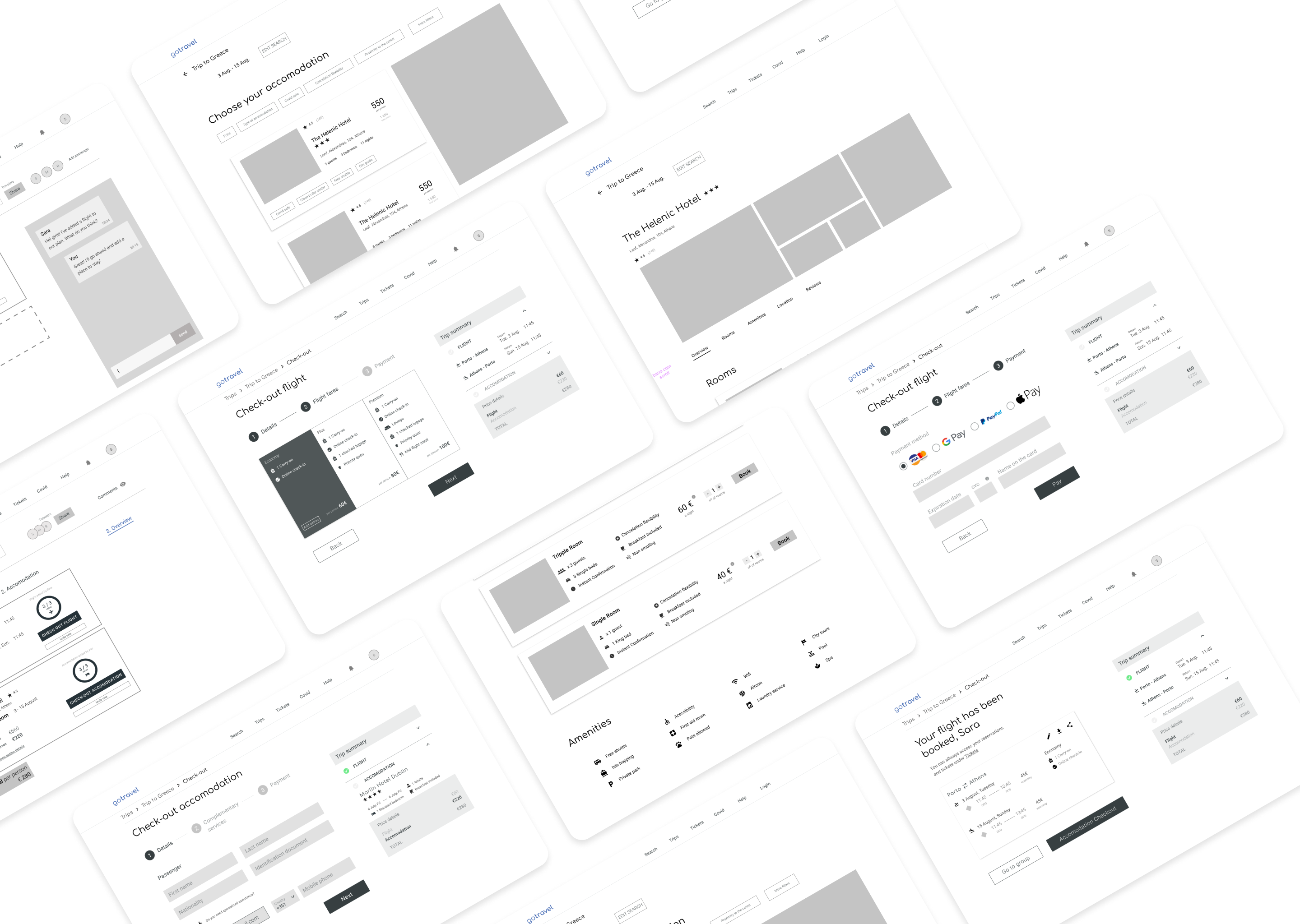
SOLUTION
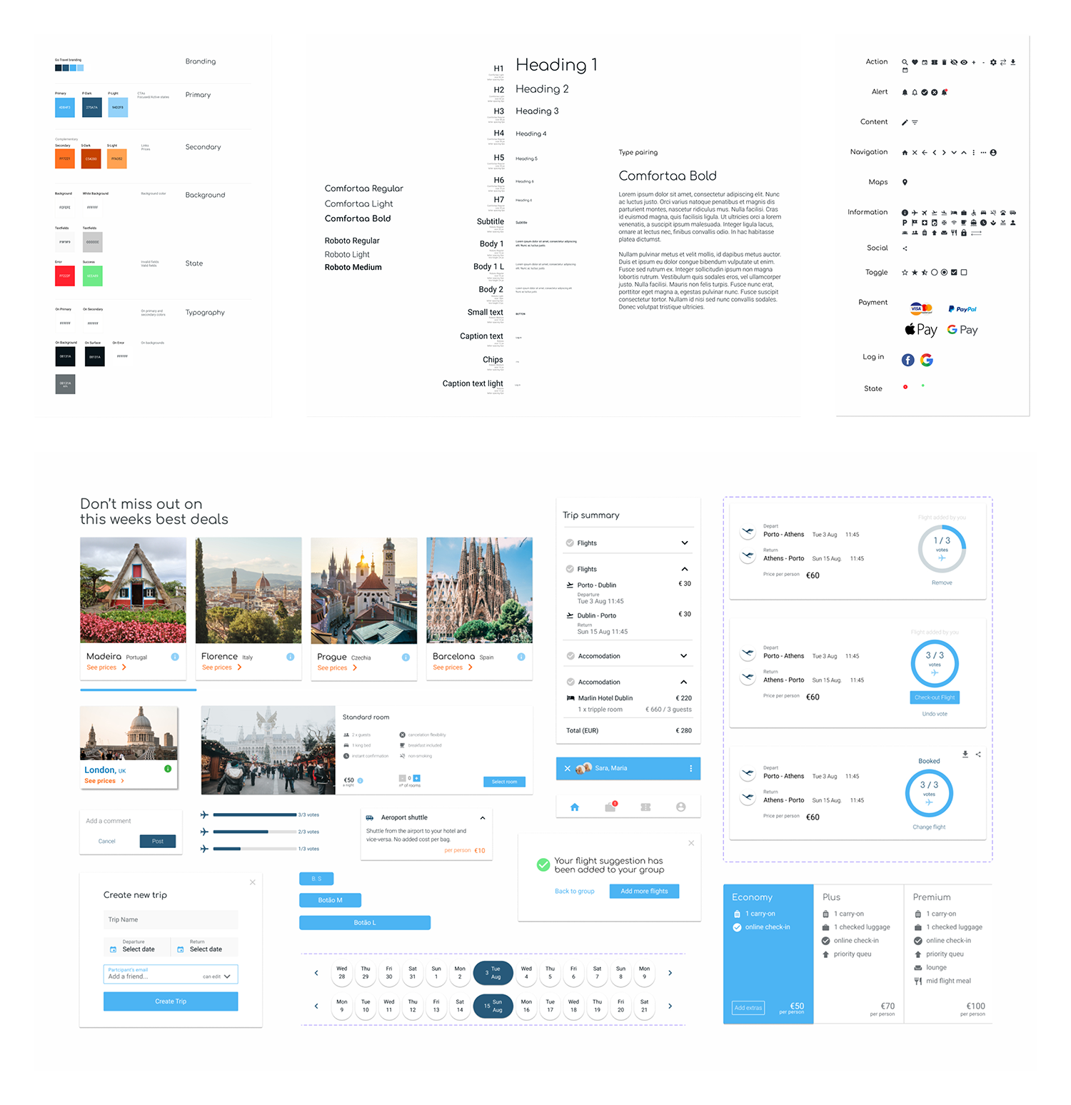
With the creative help of a design mood board, readjustments in the branding were made and the user interface, visual elements and design components developed.

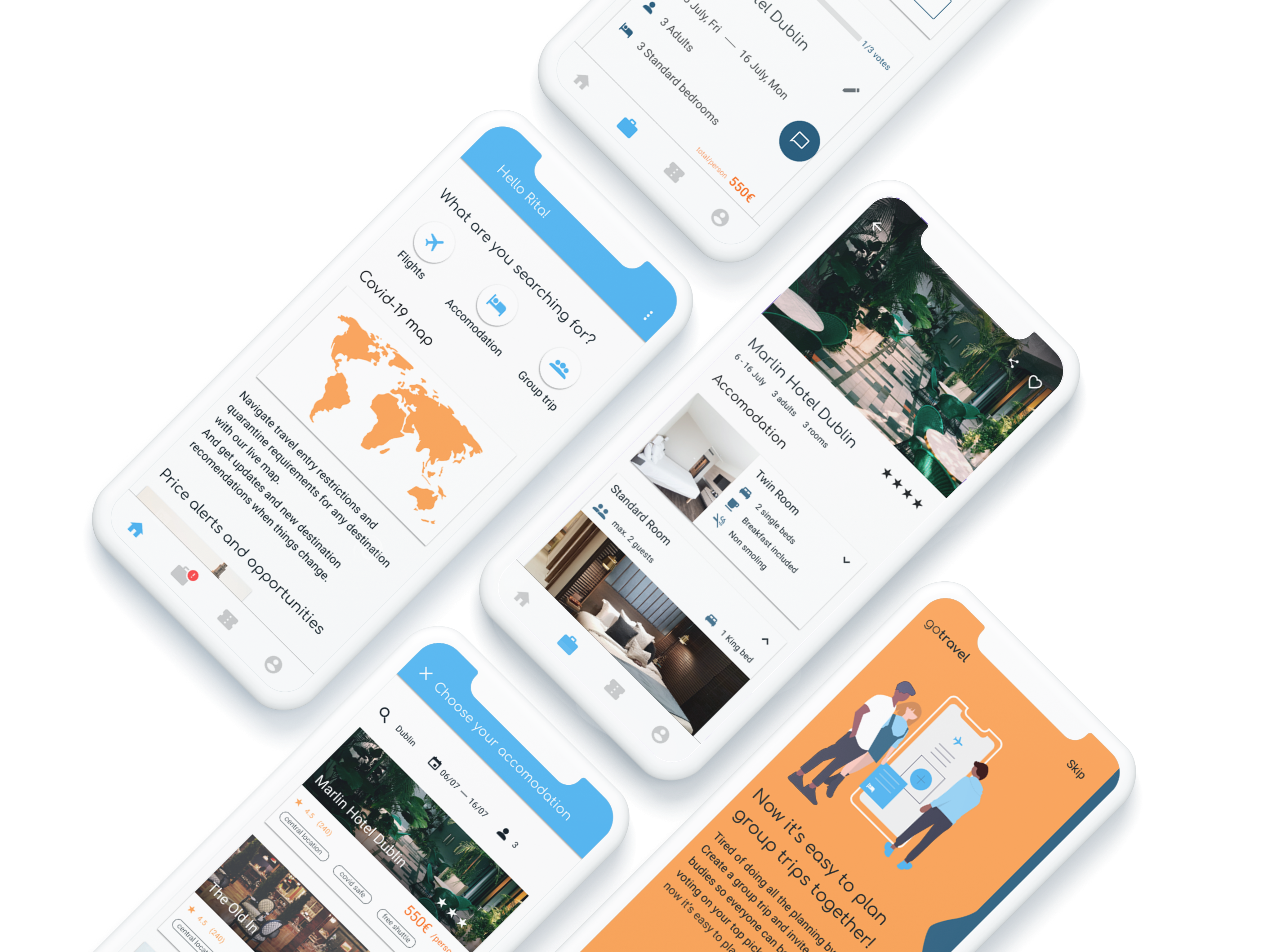
Onboarding: Users are introduced to the new service through a flow of meaningful illustrations and brief feature descriptions. Obeying to our principles of efficiency and clear communication, visuals are kept minimalistic throughout the interface.
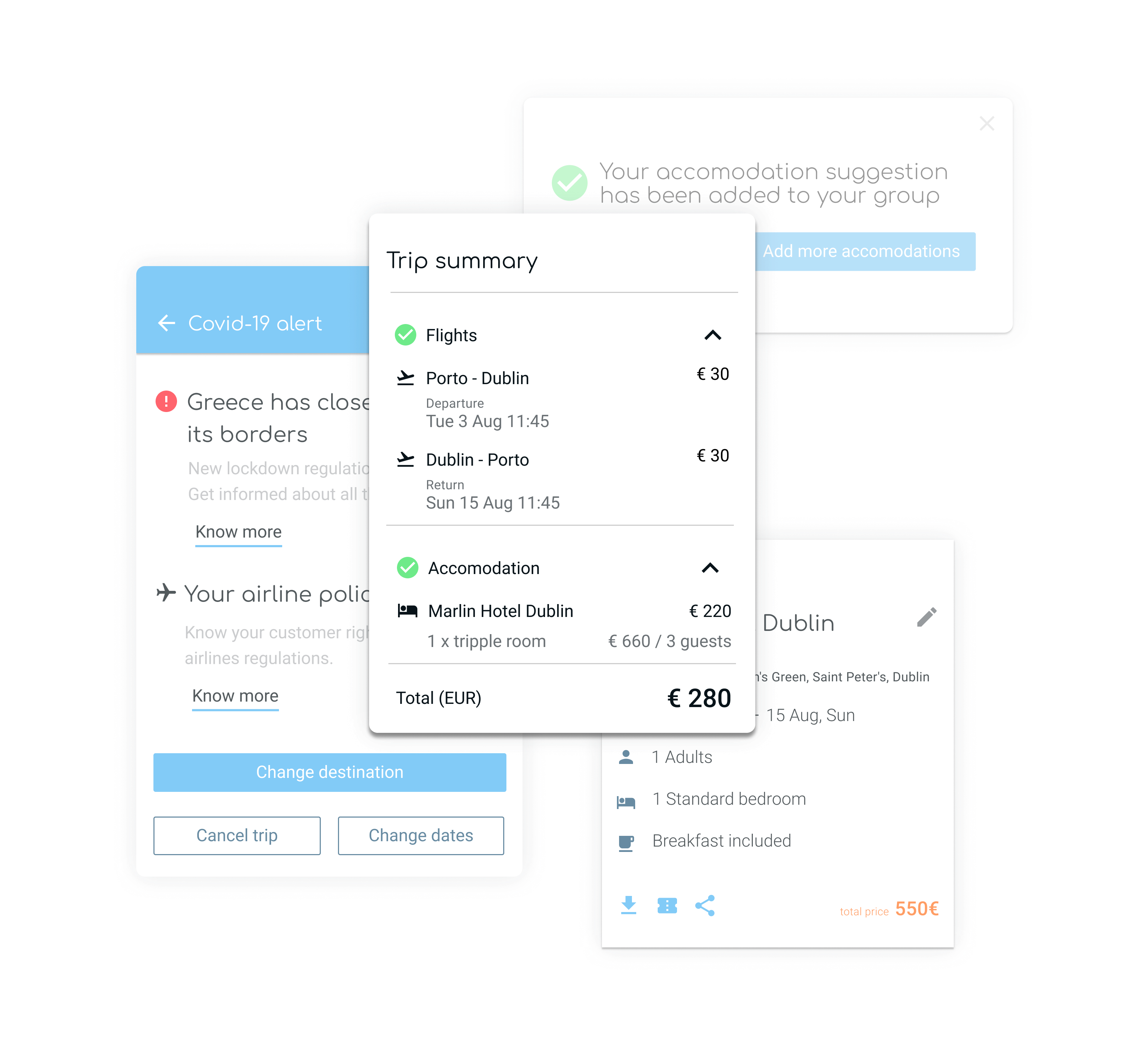
The simplified interface guarantees a frictionless user experience and clear communication. By converging functionalities and combining core features in a single platform, users can access everything they need at the same place.
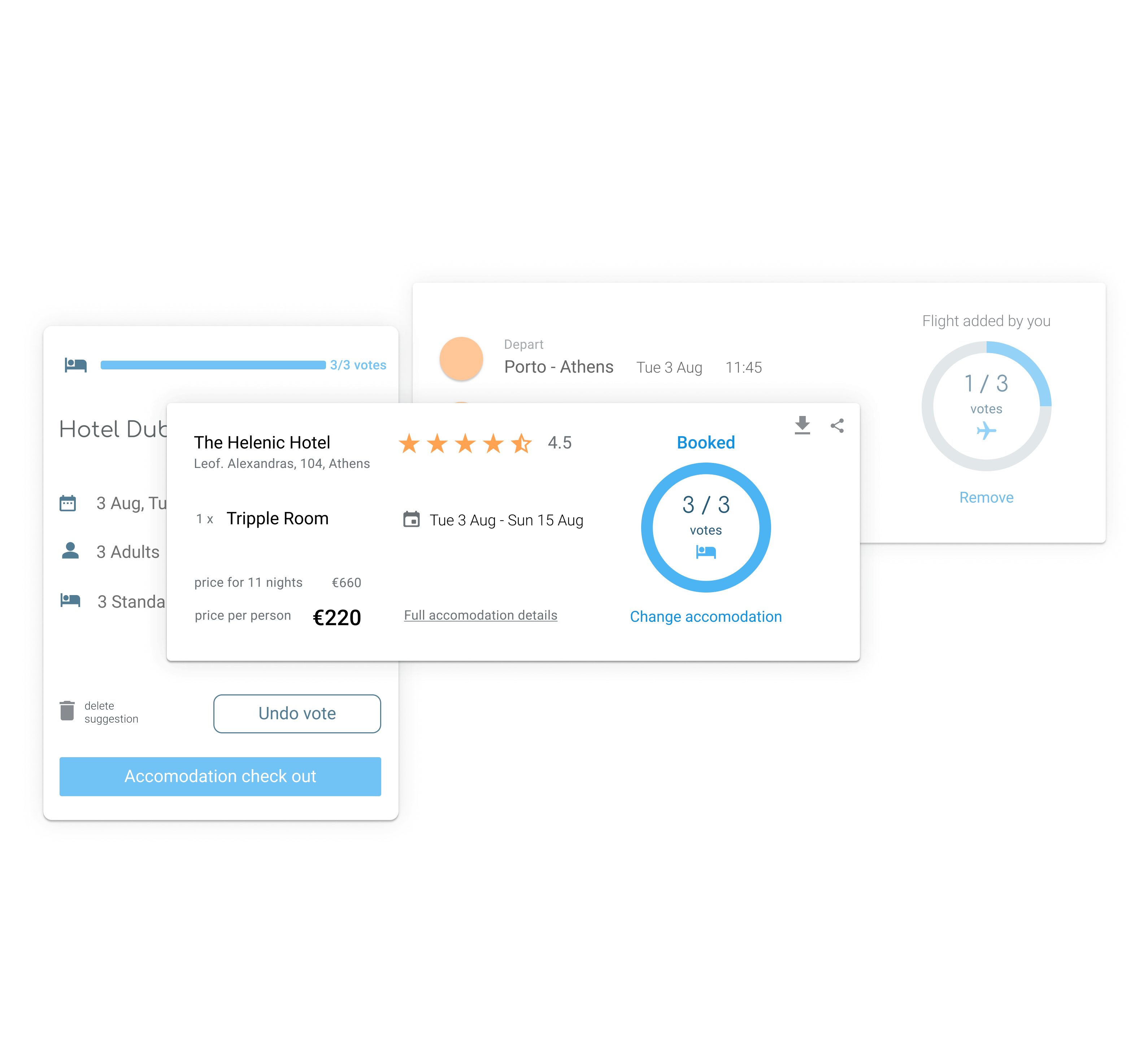
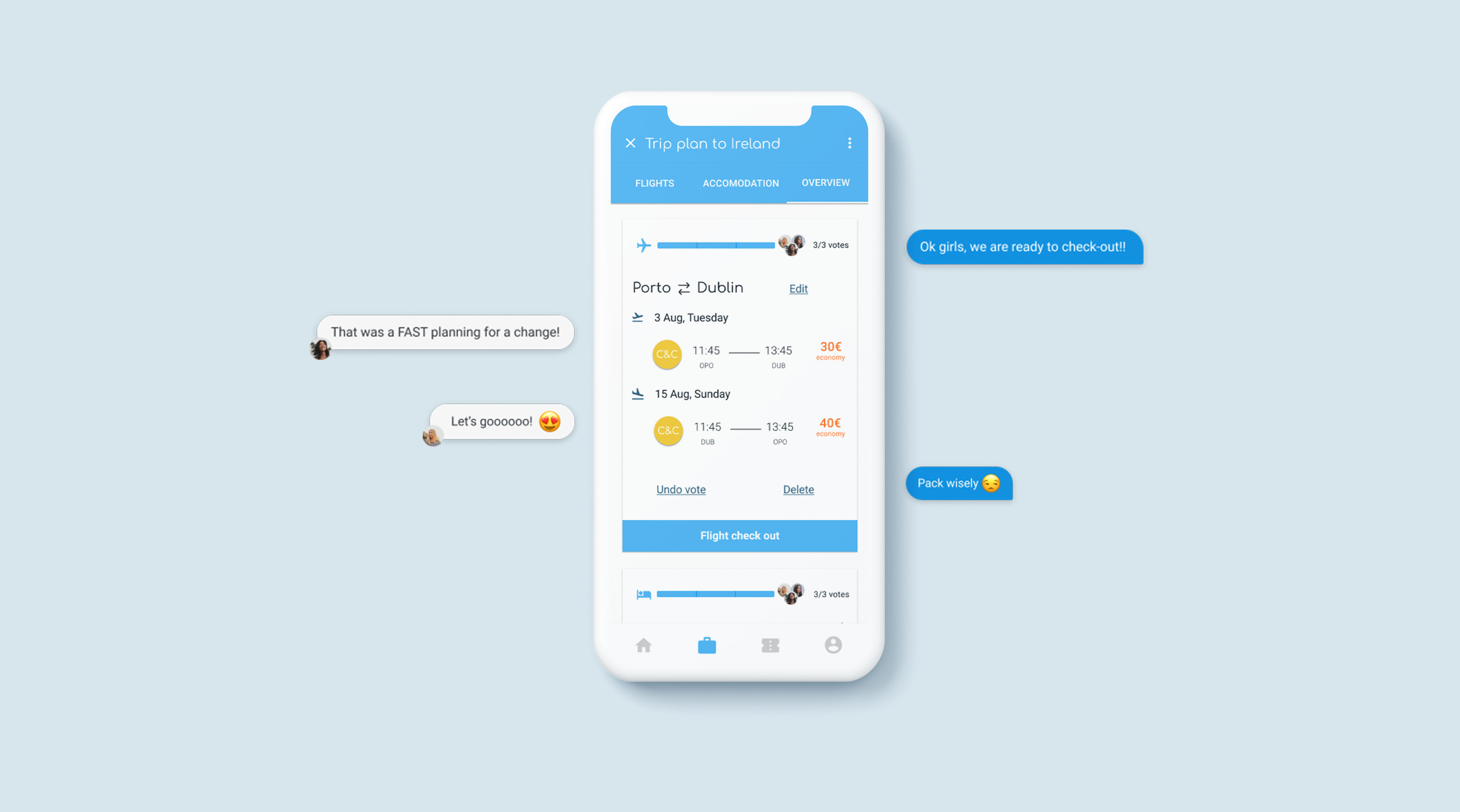
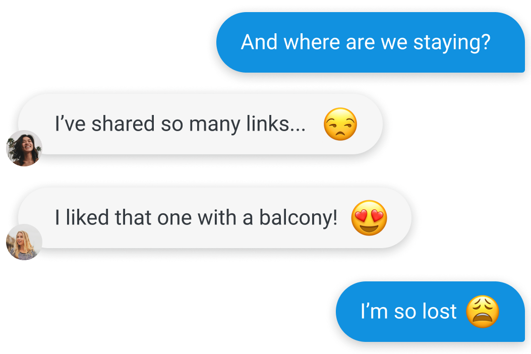
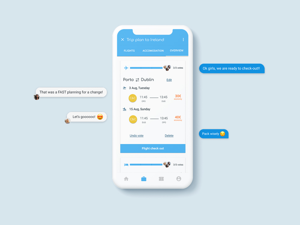
Straight-forward decision-making. With a group voting feature, users can suggest and agree on travel options in a more effective and natural way.
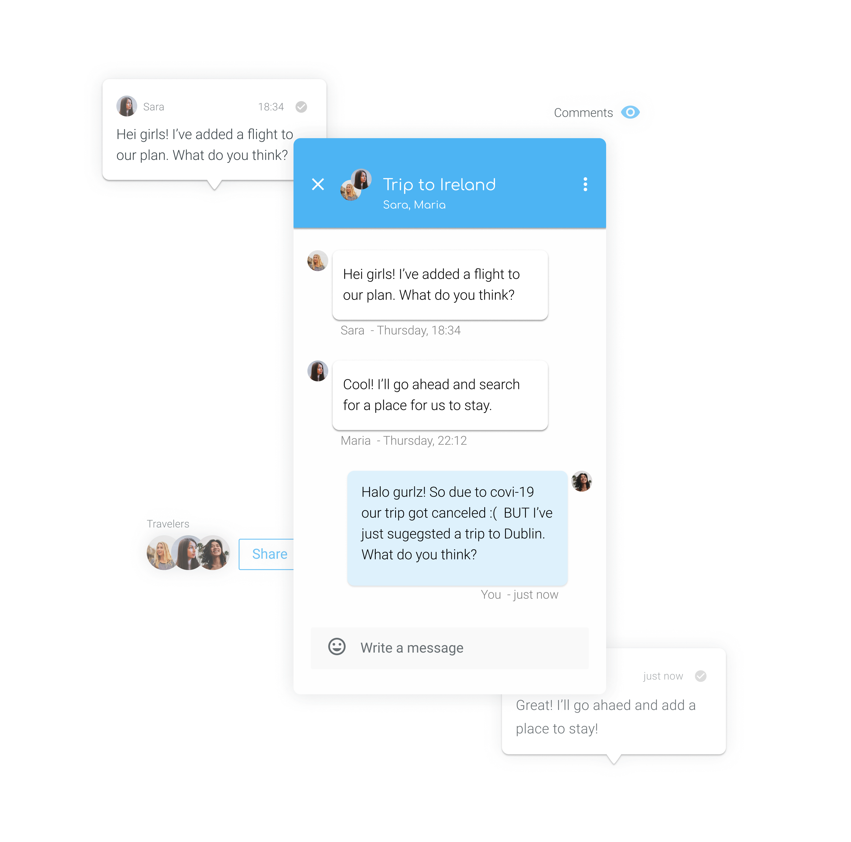
The message feature keeps the discussion at the right place, visible and contextualised for groups of users, avoiding endless scrolling and the frustration of multiples chats.
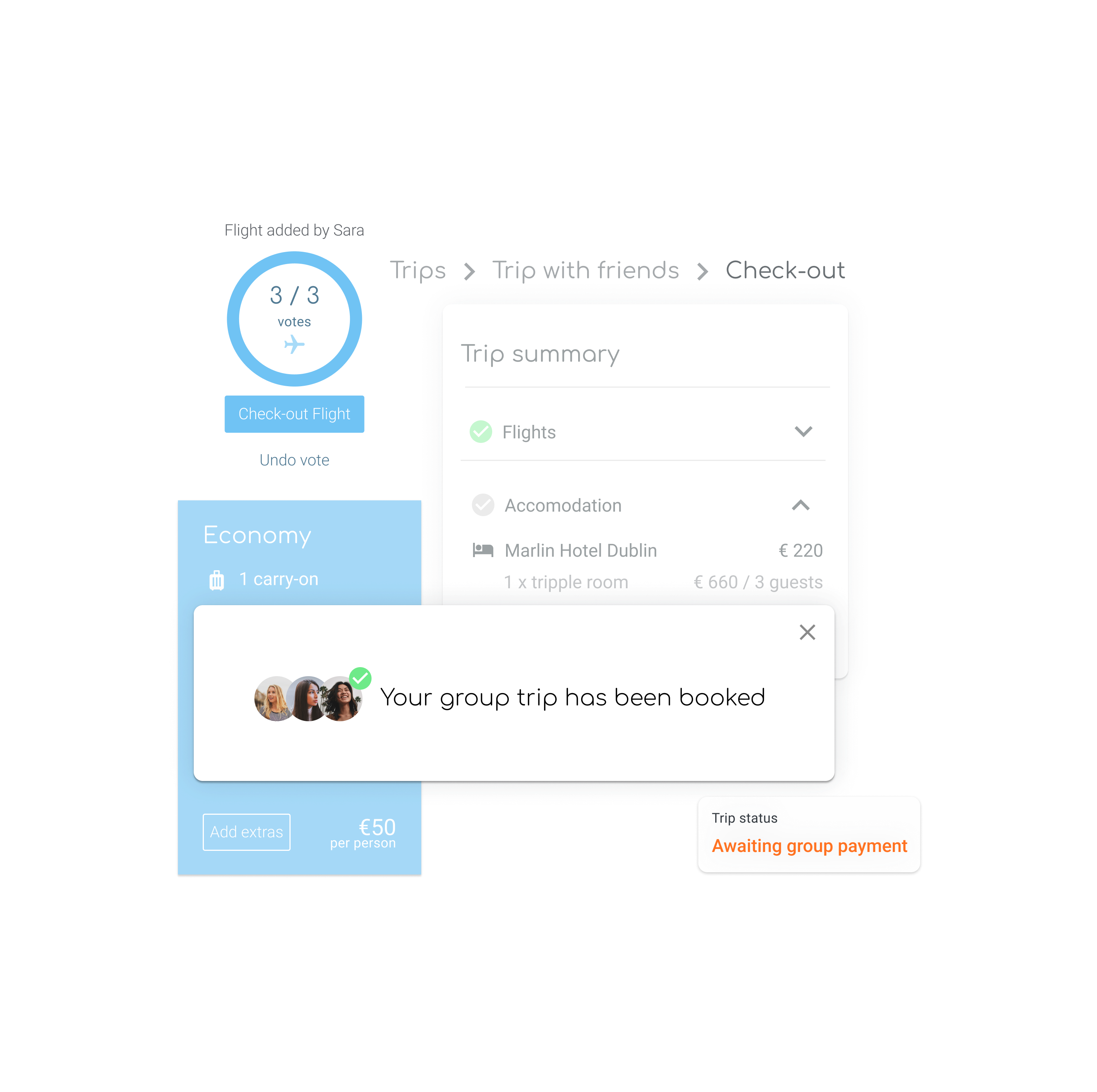
A bill splitting feature at the check-out avoids unnecessary money transfers between users, often hard to keep track of.
More cases

A new visual identity for the future of industrial software 🔒KONGSBERG DIGITAL

prduarteneves@gmail.com